
Boxercise Poster
Posted on March 31st, 2026.
Written by Charlie
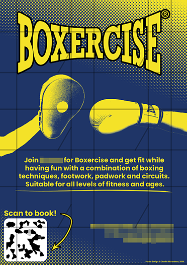
A poster I designed for a client's excerise classes. I was given permission to use it here, blurred for privacy. I used 2 colours, which keeps the design simple, and half-tones in the background simply becuase I think they look cooler than a regular gradient, and the yellow to dark blue gradient leaves an ugly torquise colour in the middle. For the main image of the boxing glove and pad, I used a gradient map to take a regular, colour photo from the client and turn it into a simple, duotone image to stick with the designs 2 colour rule. I also added a line under the main text by drawing a line with the line tool, and usign the warp tool to give it more of a shape. I feel this helps fill in some of the dead space between the text and QR code / bottom half of the poster. Low-res image to protect against theft.
The Boxercise logo is property of Boxercise Ltd.